Five core elements are a must in creating a storytelling map. We define their importance and put them to use with maps made for The Diaper Bank of Connecticut.
Digital maps help nonprofits tell their story in a visual, powerful presentation. In this case study of The Diaper Bank of Connecticut, maps of the location of infants in low-income families highlight a state-wide, city-wide, and neighborhood-specific view. Together, the digital map offers a clearer understanding of where to expand services and partnerships within the state.

Making a Good Map: The Basics
Mapping is an age-old craft that requires a high degree of graphic artistry. This has all changed with extensive data available that digital applications can represent automatically.
But map-making basics still apply! Here are five core elements to address while making a digital map.
Define Your Purpose
Before you start to make a map, it’s important to define why the map is needed. For a nonprofit, the mapping may be about identifying areas where a program is necessary. A map is a great way to identify at-risk populations, environmental hazards, or high-net-worth individuals likely to donate.
Select Your Data Sources
When Magellan was sailing the ocean blue, he was using celestial data observed over thousands of years. Today, data that can be mapped is being generated at light speed.
There are countless places to find data in our digital age. Great sources include the U.S. Census Bureau and Data.gov which is a compilation of data from many U.S. agencies. Every state also makes massive amounts of its data publicly available. For international needs, the World Bank or the United Nations can be a gold mine for data. But remember, confirm the credibility of your data sources. Checking for bias and accuracy is a must.
Clear Map Legend
The map legend describes what the map symbols and colors represent. A clear legible legend makes for a more satisfying map. If your nonprofit is new to mapping remember less is more. Legends can make or break complex maps with an excess number of symbols or colors. If you do create a legend title, it needs to correlate with the map title.
Understand the Power of Layers
What’s so cool about digital mapping is that you can layer the information of one database over another. We’ll show you what we mean in the case study below. For now, simply appreciate that by layering the information from different sources of data, you can quickly see things that could have required hours and hours of number crunching and data analysis.
Map Title
The title is the first thing most people see, so make it count! Your title should be full of purpose, framing what the map viewer is seeing.
A Brief History of The Diaper Bank of Connecticut
Founded in 2004, The Diaper Bank of Connecticut recognizes that an inadequate supply of diapers puts families with young children at an increased risk for health and parenting complications.
The Diaper Bank centralizes the fundraising and distribution of free diapers to low-income families in Connecticut through existing service providers, including local food pantries, soup kitchens, daycare centers, social service agencies, and shelters. All the families served by The Diaper Bank are low-income, meeting the criteria of below 200% of the federal poverty level.
Digital Mapping: The Diaper Bank
These digital maps were created to identify underserved communities in the distribution network.
For these maps, I used the Census Bureau to identify both levels of poverty as well as the children under the age of three. Different boundaries to bring focus to the areas most in need. One map is by Towns in Connecticut. The other is by Census Tracts in Connecticut. A Census Tract contains a population of roughly 1,500 – 8,000 people and was made to resemble a neighborhood. Poverty, as seen here, is in small confined clusters.
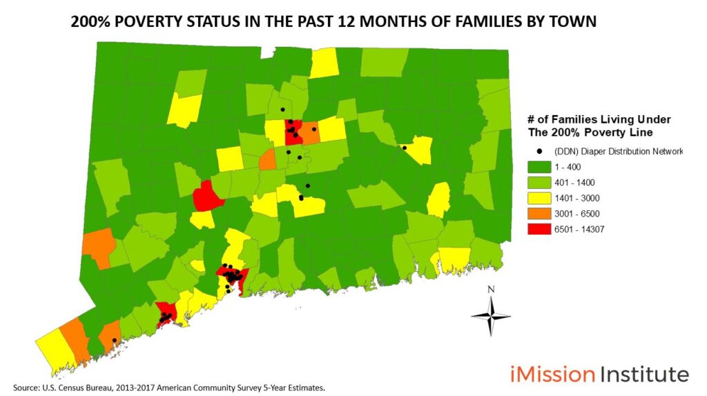
The legend plays an important role in this map because it shows more than one subject. The legend, clearly shows that the black circles are where The Diaper Bank currently has its distribution partners. Next, it shows by color which cities have the most amount of families living under the 200% poverty line. We see red, orange, and yellow cities as opportunity zones to expand the distribution network.
For this map, we have 3 layers of data. A boundaries layer showcasing the boundaries between each Town and Census Tract. Next, we used the data from The Diaper Bank of CT and input the locations across CT. Lastly, we used the data from the Census Bureau to get data for each Town and Census Tract.
The title of the map is clear and concise. I decided to use a legend title to showcase that the numbers represent families living at or below the 200% poverty line.
But political boundaries often don’t tell the real story of poverty. Within a city or town, poverty is often concentrated in neighborhoods. Census Tract data lets us take a closer look
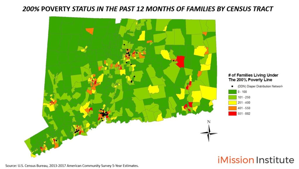
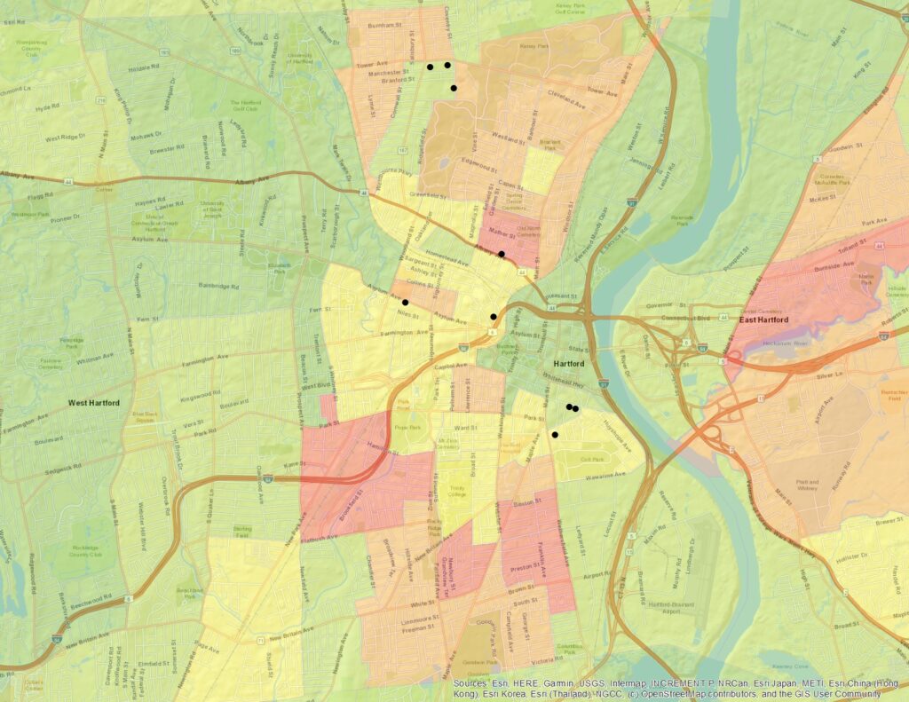
This map shows an in-depth look at the number of families living under the 200% poverty line by Census Tract within Connecticut. This scale is important to have a more targeted approach. We can now target the neighborhood level. The Diaper Bank of Connecticut can more effectively identify distribution partners near the clusters of diaper needs.
Creating Your Storytelling Map
If you’re interested in creating a storytelling map for your nonprofit organization, remember to define the core mapping elements:
- Define the Purpose of Your Map
- Select Your Data Sources
- Identify the Clear Map Legend
- Understand the Power of Data Layers
- Create an Interesting Map Title
iMission Institute uses digital mapping and other visualization tools to enable nonprofits to elevate program impact and stakeholder engagement. Are you interested in learning more about nonprofit marketing, fundraising, and advocacy in the digital age? Email us or give us a call at (203) 747-8042.